Black and white for web
Download high-resolution for graphic production.
Download high-resolution for graphic production.
Download high-resolution for graphic production.
Download hi-res negative (white) logo here.
Download high-resolution for graphic production.
Download high-resolution for graphic production.
Download high-resolution for graphic production.
Download high-resolution for graphic production.
Download high-resolution for graphic production.

Download high-resolution for graphic production.
Download our corporate sub and brand-logos here. PRIMO Medico operates under a separate logo. The logo is "hand drawn" and based on the original PRIMO and PRIMO SYSTEM logos.
Several product brand logos have also been designed. These are primarilly intended for use when composing marketing collatteral or product packaging. All logos use PRIMO corporate colours and may not be alterred or redrawn in any way.
Download high-resolution for graphic production.
Download high-resolution for graphic production.
Download high-resolution for graphic production.
Download high-resolution for graphic production.
Download high-resolution for graphic production.
Download high-resolution for graphic production.
Download high-resolution for graphic production.
Download high-resolution for graphic production.
Download high-resolution for graphic production.
Download high-resolution for graphic production.
Download high-resolution for graphic production.
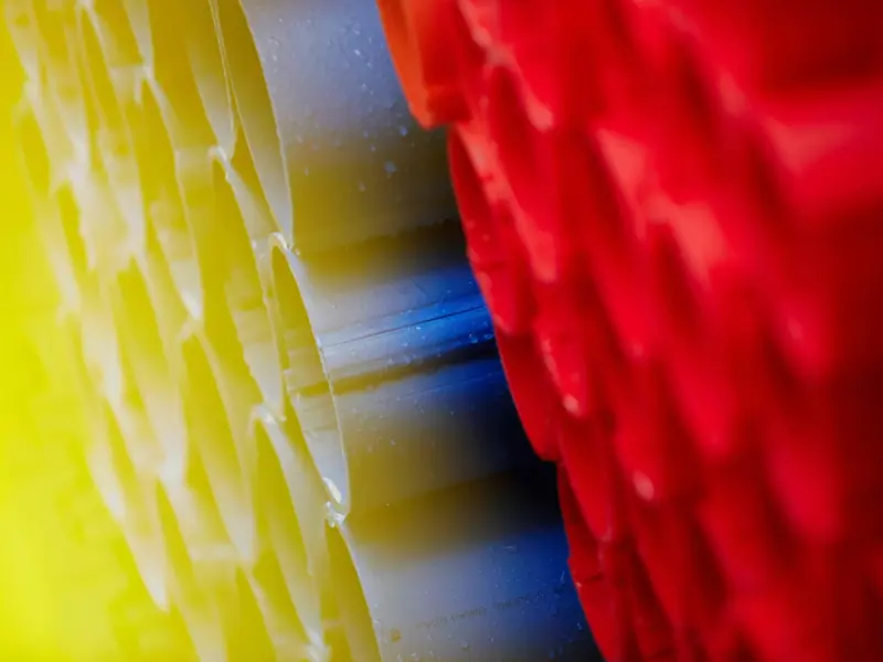
The Primo Colour palette is based on the deep blue Primo signature colour. To add more values to the blue two other colours are selected as secondary colours. The Primo gray adds more quality and robustness to the basic blue, whilst the yellow adds dynamic edge and lends the design a modern expression. Also, the bright warm yellow tone gives the Primo signature blue the necessary contrast needed to avoid a “sleepy” expression.
The three basic colours are defined using the Pantone® Color Matching System - Pantone® PMS. Other colour systems and definitions may only be used according to the combinations shown in the DesignGuide. On rare occasions it will not be possible to use any of the authorised colour systems. In these case you should always consult a Pantone® Matching System ColorGuide for the best possible match of tone.
All the downloadable production templates supplied with this guide contain the correct colours for production with both CMYK and Pantone®.
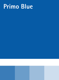
Pantone® System (PMS)
300 C
CMYK
C=100 M=43 Y=0 K =0
Natural Color System
NCS - S 3060-R90B
RAL industry paint
RAL 5017
RGB/HEX for screen use
#0072bb
RGB for MS Office use
R=0 G=114 B=187
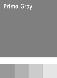
Pantone® System (PMS)
Cool Gray 9
CMYK
C=0 M=0 Y=0 K =50
Natural Color System
NCS - S 5500-N
RAL industry paint
RAL 9007
RGB/HEX for screen use
#7F7F7F
RGB for MS Office use
R=127 G=127 B=127
Pantone® System (PMS)
123
CMYK
C=0 M=20 Y=100 K =0
Natural Color System
NCS 0580-Y10R
RAL industry paint
RAL 1018
RGB/HEX for screen use
#fec424
RGB for MS Office use
R=254 G=196 B=36
Work clothes etc. may be decorated with a logo, payoff and any other information of choice. The style will depend on the design of the clothes. The colour may be Primo blue (and grey), black or white.The swans must always be white.
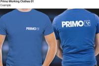
Download an example and the CORE graphics.
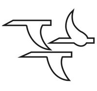
Our logo did not always look as it does today. As the Group evolved from a local West Jutland firm into an international group of companies, our logo has been modified at regular intervals, so that it has always been an attractive and up-to-date symbol for PRIMO. For many years a constant feature has been the three flying swans.
It was not initially the intention that the swans should become the most important feature of the PRIMO logo. The swans were originally crafted as a brickwork relief on the gable end of a new factory building in Tistrup. They were designed by the architect Carl G. Neumann and were seen by the public for the first time in 1968. They can still be found today in their original site.
Not long after – in connection with the publication of our first catalogue in 1969 – the earliest example of the firm’s name then – “PRIMO-PLAST” – can be found combined with the swans. The swans are white with a black “shadow” and are ”framed” by a stylised drawing of a gable end.
In 1979, “PRIMO System”, the sales name for window profiles, introduced its own device mark: a red square with white text and with PRIMO written in a singularly distinctive typeface which we now call the PRIMO monogram.
Initially, the square did not feature a frame; but it was not long before an internal white frame was added, giving the red square the characteristics of a window.
The upgrading of the PRIMO System logo soon had an impact and so the next time the logo was developed (again in connection with the publication of a new catalogue in 1984), a major change was made. “PRIMO” was now also written here in the highly distinctive logotype.
The swans featured as before, white with a black shadow, but now on a yellow background in a black square frame corresponding to the red square of the PRIMO System logo.
The yellow background colour, however, did not last long, and as early as 1986 it was changed to blue, heralding the latest modification of the PRIMO logo.
The yellow background colour, however, did not last long, and as early as 1986 it was changed to blue, heralding the latest modification of the PRIMO logo. The upgrading of the PRIMO System logo soon had an impact and so the next time the logo was developed (again in connection with the publication of a new catalogue in 1984), a major change was made. “PRIMO” was now also written here in the highly distinctive logotype.

Jaakko Salo is the group's head of sales, with a broad understanding of the different markets and industries. In close collaboration with Primo’s dedicated sales teams, Jaakko is your guarantee for a future-fit approach to product development. In the area of sales development, Jaakko is at the forefront of the search for advanced solutions with a lower carbon footprint and faster time-to-market, in line with our FUTURE FIT programme and our slogan "Profiles of Tomorrow".
Speaks: English, Finnish